NCAA Men's Regional Championship Ice Revamp
- TheFaceoff.net
- 6 days ago
- 1 min read
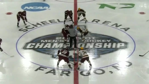
In recent seasons, the NCAA's Men's Regional Championship games featured a simplistic and somewhat non-descriptive center-ice logo. However, this year they've introduced a fresh design that integrates familiar elements with new, dynamic features. The updated logo retains the skater from previous iterations but now includes a graphic interpretation of the Regional Championship trophy. Additionally, the year of the tournament is prominently displayed, creating a clear time marker for highlights and replays—a detail that could enhance historical context for future audiences.
The customized center circle continues to incorporate the arena name at the top and the city/state at the bottom. However, spacing and alignment issues sometimes arise, especially as they attempt to balance the text across the red line. Despite these occasional imbalances, the personalized design helps ground the event in its specific location and adds to its identity.
This revised approach feels like a step forward, adding both aesthetic appeal and functional clarity to the branding. What do you think of this evolution? Does it strike the right balance between tradition and innovation?
Here are the four center ice layouts used in the 2025 Men's Regional Championship. Be sure to check out the NCAA center ice archive to view the full rink designs.


Comments