Looking ahead to the 2023, we thought it would be fun to remix all 32 NHL center ice designs. The rules we will follow are simple: No matter how perfect the ice may be, there must be a change. This could be something as small as a red line change, or as large as a complete re-design. Today we will take a look at the Metropolitan Division.

The Carolina Hurricanes logo makes it hard to mess up their center ice design. We simply brought back the black boxes inside a red line and wrapped them around the circle. I wish they could also have them in the center line like they used to, but black paint inside the center line breaks NHL rules.

A patriotic team like the Columbus Blue Jackets should have a little more color at center ice. We gave them a think blue circle around the primary logo and moved the name inside. A couple of Columbus-style stars and the center ice really stands out.

The New Jersey Devils ice has bothered us for years. The logo has an off-centered circle under it which really becomes noticeable at center ice. While we didn't change that, we did add a black circle with red trim around the edges of the circle to help distract from this.

How can we really improve the New York Islanders? It is already a really nice-looking ice, and the small UBS Arena logos around the circle are balanced and subtle. We thought the red line is a bit distracting against such a large logo. We tried a solid red line but in the end, a white center line with red trim provided a clean look.

The New York Rangers center ice has remained the same for several years, and it would be hard to beat. We decided to have just a bit of fun with it by removing the trim and wrapping a bit of the Manhattan skyline around the lower half of the circle. We also lightened the blue in the logo and circle a bit.

The Philadelphia Flyers have a history of using a bold circle inside the center ice during its Spectrum years. We decided to bring it back but this time it wraps all the way around, and the arena name fits inside. The red line is a variation on their current triple red stripe pattern. We just made it more of a checkered look.

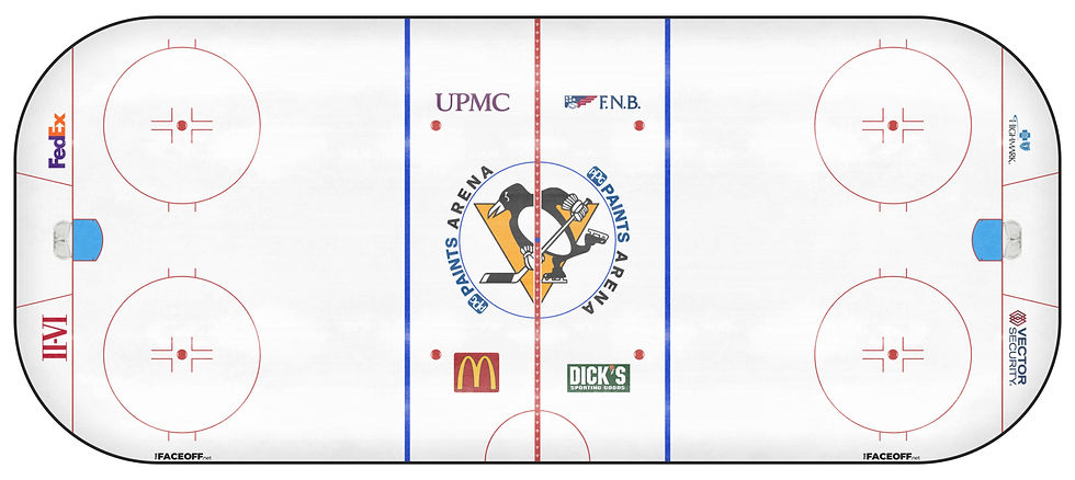
It was very hard to find something to change on the Pittsburgh Penguins ice. The arena wordmark is perhaps the only complaint we have about it, so we moved it to the sides for balance. While there is nothing wrong with the diamond center line they have had for years, we thought we might try their primary logo on it instead.

Will this finally be the year that the Washington Capitals redeem themselves with their center ice design? The 'Weagle' logo would look so good at center ice, and certainly far better than their wordmark. Again, for balance, we moved the arena name to the sides. This creates a very clean look.
What do you think of these changes? What would you do differently?
Comments